A NEW LOGO, SAME ATTENTION TO DETAIL
#redesign #sensetime #obakudenmark #logo #typography #excitingtimes
A few words to begin with...
Obaku decided to officially take the wraps off its redesigned logo and typography. Every transformation requires an adjustment and transition period.
Obaku is no exception. That’s why there will be times when both the old and new can and probably will be seen alongside each other. That’s okay, as every change needs time.
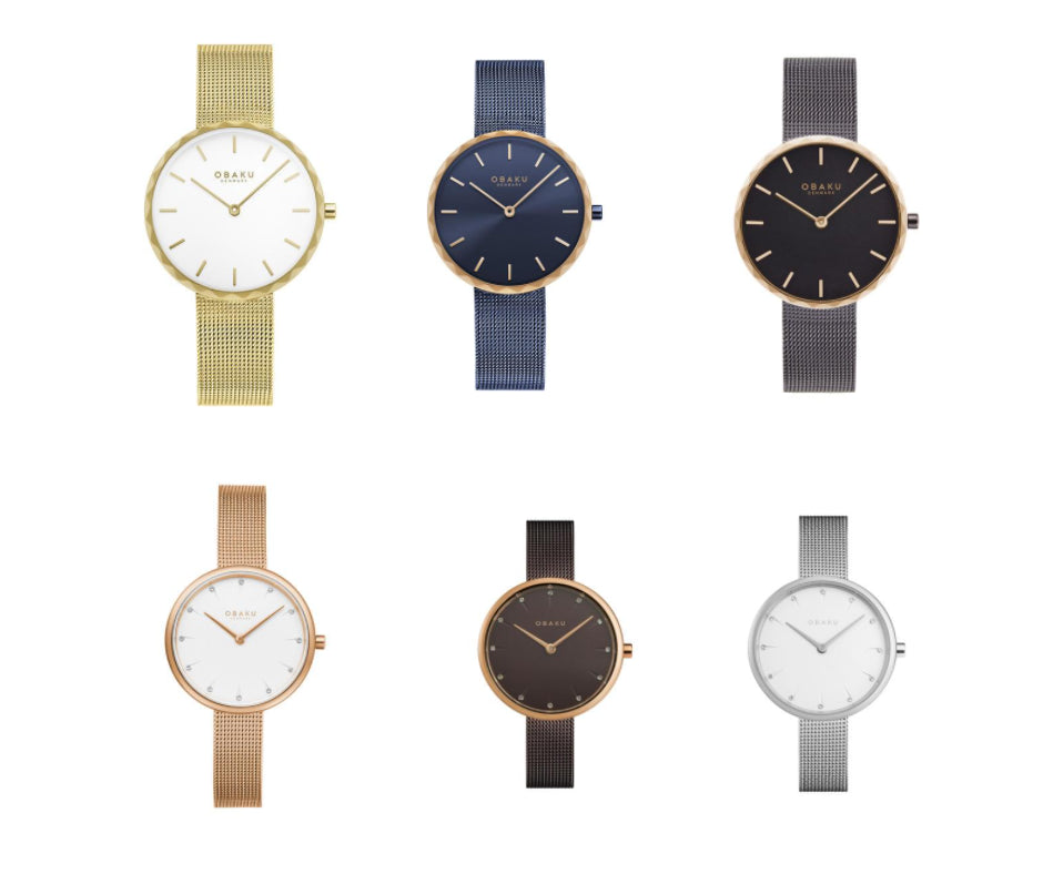
Eventually, all Obaku watch products and those, which follow - print and web - will bear the redesigned logo and typography.
These are exciting times!
To better understand the reasoning, where is Obaku coming from and where it's headed, read below.
HOW IT ALL STARTED
When Obaku was founded in 2007, Johannes Arvin and Catherine Chan, the two co-founders, were thrilled about the idea of converging the two cultures they represented - Danish and Asian. The idea was to bring these two vastly different worlds together in a unique and captivating blend.
Two talented product designers - Lau Liengård Ruge and Christian Mikkelsen - who have been part of Obaku’s visual core since its inception, filled the company’s watch portfolio with Scandinavian simplicity while keeping great respect for the company’s Asian roots.
As time passed, Obaku further developed its narrative. One that branches out and creates a world beyond a simple story. One that’s filled with simple moments and candid impressions. One that becomes a culture and a way of living on its own.
When Catherine and Johannes had the initial idea about Obaku, they didn’t imagine in their wildest dreams what it would become in over a decade - a sprawling business with employees spread across offices in Hong Kong, Denmark, and the United States and a distributor network in over 70 countries.
TYPOGRAPHY
Obaku’s trademark Enso circle and typography were unchanged for over a decade. Spring 2019 changes all that. It brings Obaku into the future and sets it up for the next decade. With that in mind, the company chose to fully embrace its design roots. It chose to embrace minimalism and simplicity as its primary aesthetic. It chose a new way forward.
The first step in Obaku’s transformation was its font. Both designers and senior management unanimously agreed to replace the outdated ScalaSans typography, which was used since the company’s inception. “It was increasingly becoming rigid for the modern web and our marketing intentions,” says Lau Liengård Ruge, one of the two Obaku designers. “We searched high and low for a suitable replacement. In today’s crowded market one needs to tread carefully as font families and typography can greatly vary in price and quality.”
After exploring the market Obaku settled on a replacement that sums up their typography, web and print needs - both professional and philosophical.
"A multi-width geometric type family designed around the circle."
Enter Uniform. “A multi-width geometric type family designed around the circle,” as Richard Miller, creator of the type family, describes. “Uniform was first drawn starting with the Black weight. This careful process allows each character to look consistent and balanced through all weights. As a result, the typeface does not ‘break down’ or lose its form in the boldest weights like many typefaces do.”
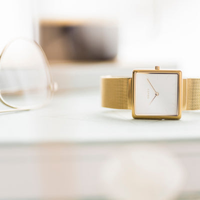
Uniform will replace ScalaSans in all of Obaku’s print materials, web endeavors, and the watch font itself. This brings us to the distinctive Obaku logo found on every watch’s front and back. Let’s talk about it.
LOGO & IDENTITY
The most influential brands in the world are recognized by their products, their name, and their logo. The better the logo design, the easier it is to recognize and even associate oneself with the brand. Brand identity moved beyond being just a buzz word used in millennial circles, it became a crucial element in building a successful identifier. That’s why Obaku’s new logo is so important to talk about.
The primary idea for the update was introduced last year by Lau Liengård Ruge, Obaku’s creative watch designer.
"A modern angle on Obaku's company identity."
The new and original logo represents a modern angle on Obaku’s company identity. Still rooted in both Danish design and Asian Zen traditions, the new logo is a flexible, integrative and compact vision of the previously Enso-dominant trademark. Instead of having a prominent circle on top, Obaku decided to subtly integrate the curves into its typography-driven logo.
This is a great example of thoughtful design and a testament to Obaku’s attention to detail. This is how two can become one.

THE WAY FORWARD
Obaku has gained an edge. Its clearer, sharper, and more modern look marks the path it’s on. It symbolizes a move forward. A move towards the future of what it is aspiring to be.
The change also signalizes the company’s intent on staying focused. It is ready to make bold moves to show it means business. Take their online strategy for example where they invested in influencer campaigns, brand awareness, and video content. On top of, they experiment with traditional TV ads, themed collections, and even guerrilla marketing. All to enrich the Obaku experience and bring a vibrant portfolio of high-quality products that easily mesh with modern styles and trends closer to customers.
"...ready to take bold moves to show it means business."
Obaku’s updated logo, typography, and watch styles were revealed at the Basel 2019 watch fair in Switzerland. This exciting change will set the theme for Obaku for years to come.